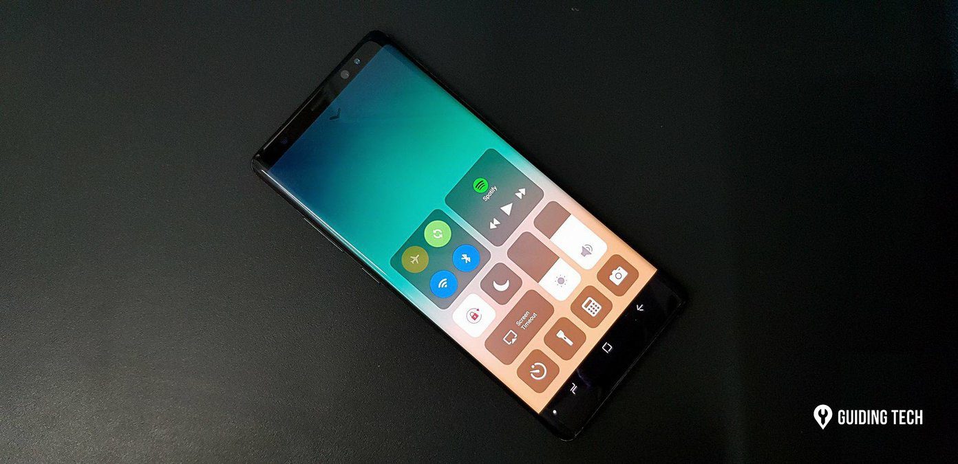
After being accustomed to CC, it’s the feature I miss the most on Android. And before you say it, I know where Apple got the idea but when you think about it, the toggles pane in the notification drawer is nothing like the Control Center. Play Store is filled with Control Center clones but many of them look out of place on Android. Quick Control Panel is a Control Center app that’s built for Android itself.
What’s So Special About Quick Control Panel?
You can invoke Quick Control Panel using the Google Now gesture if you have on screen navigation controls or you can enable swipe gestures from any edge of the screen. It’s all very customizable. And that applies to features as well. Quick Control Panel takes what’s the best about Control Center and adds the best of Android to it. So you can do things like add shortcuts for apps, extra toggles, and customize how each and every element looks. QCP takes cues from Google’s Holo design language, which admittedly is getting old but it fits well with the current Android UI. While you can’t do anything about the boxy panels, you are free to mess around with the colors for each and every element. Just don’t go too crazy.
Customizing The App
From Launch settings in the Settings menu you can customize the swipe detector position. I’ve set it to launch when I swipe up from the bottom right edge because that’s where my thumb usually rests but you can set it any way you like. Toggles lets you customize the layout of toggles. Tap the Enable/disable/order button to, you guessed it, enable, disable or order toggles. Bring the most common toggles like data, Wi-Fi and Bluetooth to the top. From the Appearance section below you can adjust the size of the toggles and distance between them. I found the toggles to be a bit too big so I decreased the size a bit. This way you can fit more of them on screen. Shortcuts setting allows you to add shortcuts to any app you may have installed. They show up in the top panel by default (this, of course is also customizable). Once you’ve added your most used apps, swipe down to disable app titles and to reduce the shortcut sizes and padding. This vastly improves the presentation. You can also apply icon packs. You can remove the information panel that shows you the time, date, and battery percentage if you don’t find it useful. Lastly, the Panel order page allows you to reorder the panels. So, next time your friend boasts about how awesome the Control Center on his iPhone really is, all you need to do is show him this. That’d be the quickest retort for sure. The above article may contain affiliate links which help support Guiding Tech. However, it does not affect our editorial integrity. The content remains unbiased and authentic.


